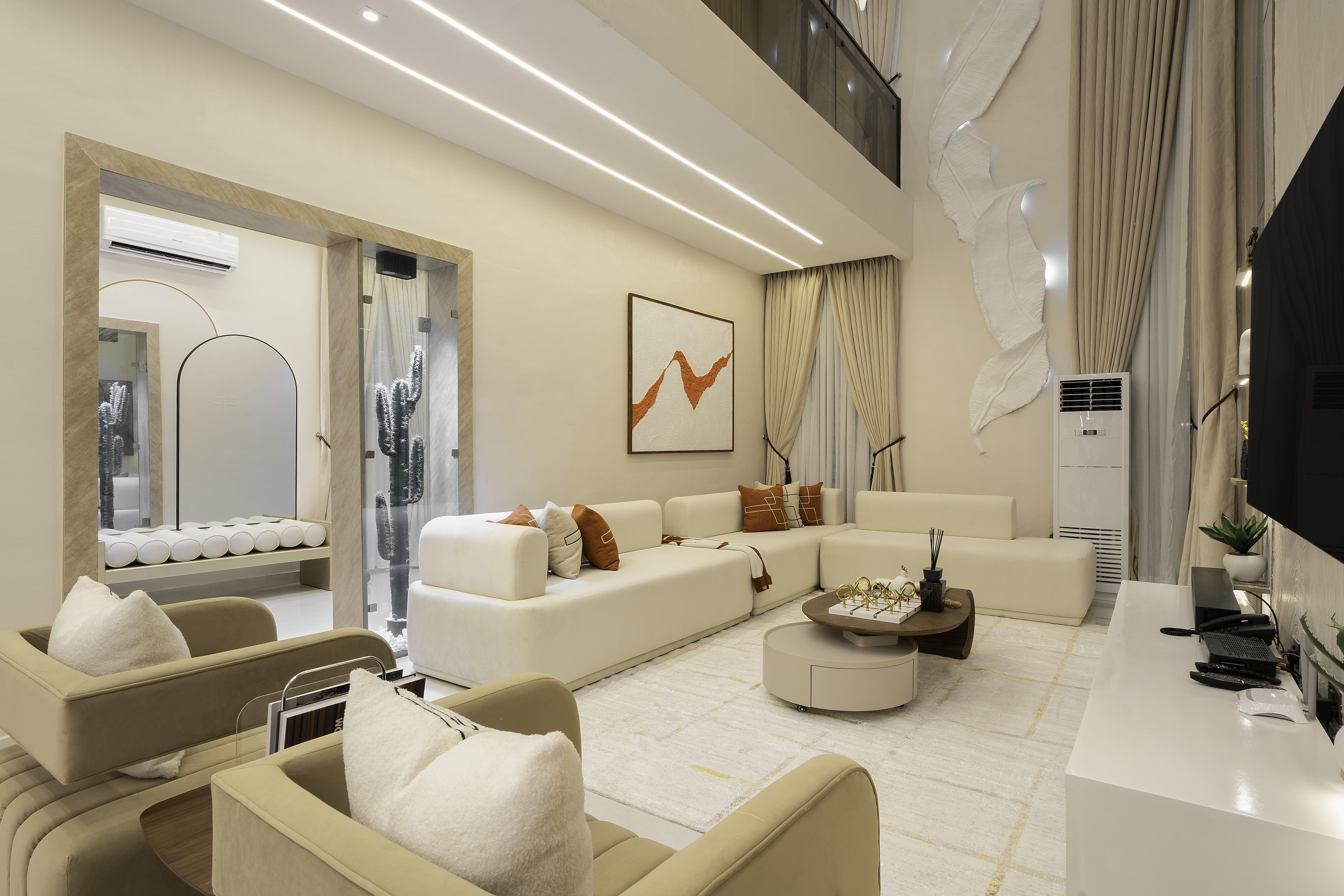
Colors are more important than we think. Colors shape the way we experience the world more than we realize. Think about how calming soft neutrals like beige can feel after a long day at work, or how certain bold colors like yellow bring energy into a room.
Colors communicate personality, create atmospheres without uttering a word
That's why choosing the right color palette is such a big deal in Interior design. The colors you bring into your home can influence its atmosphere.
Is it warm and inviting?
Is it calm and serene? Or is it bland?
Whether you prefer warm neutrals, bold colors, or earthy tones, an approved combination can transform your home. A well-planned color palette helps to create a visual harmony and flow.
Colors are design tools used to make a small room appear larger, or add some style to a plain room.
Understanding how to combine colors properly is essential for creating a sophisticated and functional interior.
Here are some tips for choosing the right color palette for your space.
1. Start with the mood you want to create
What do you want? What are you going for?
Before you select paint colors, furniture, and decor pieces, think about the atmosphere you want the room to have. Different shades create different emotional effects.Colors like beige, cream, and warm white are known to create calm and timeless atmospheres. Earthy colors are known to bring a warm, natural feel to a home. Darker shades are known to add a touch of depth and elegance to a room.
Your color choices should reflect both your personal style and the space's purpose. It's always advisable to use relaxing tones in bedrooms and more vibrant colors in the kitchen.
2. Understand the 60-30-10 color Rule
One of the most effective principles in interior design is the 60-30-10 rule. It's a theory that helps designers create balanced and visually appealing spaces.
60% of the room should be painted in the dominant color. This is seen on walls or floors. While 30% of the room should be the secondary color, it supports the dominant color and is introduced through curtains, rugs, or accent furniture. The remaining 10% is the accent color. It’s the brightest color in the room which is introduced by decorative accessories like throw pillows, vases, clocks, etc.
60-30-10 color theory helps to prevent spaces from looking chaotic or unbalanced. It creates structure for spaces while allowing room for creativity and personality.
3. Consider Lighting
Lighting, on its own, plays a role in how colors appear. Natural light can make shades look brighter, while artificial lighting may alter undertones.
You should always test paint samples at different times of the day before making a final decision.
4. Pay attention to Spacing
No matter how we want to argue this away, your room size also matters. Lighter shades tend to open up smaller spaces, while darker colors create a cozy and dramatic feel in larger rooms.
Choosing the right color palette elevates the interior design of your space. By understanding color psychology and applying the 60-30-10 color rule, you can create spaces that feel balanced and welcoming.
A balanced color scheme enhances comfort, reflects personality, and turns your home into a beautifully thought-out home.